# In general, I didn't code this myself. Compiled from various sources.
# lib(s): ade4, xtable
#
Download this script (.rtf file)#
Red indicates stuff you have to edit.
# - START OF PCA SCRIPT 1 - [alpha tested ok on 26 Jul 2010. Not sure if it really does what it's supposed to do.]
# Data input:
generic RmodePCA1 <- function(VarsOfInt) # no categorical variables allowed in VarsOfInt
{
infile.pca <- prcomp(VarOfInt,retx=TRUE,center=TRUE,scale.=TRUE)
#sd <- infile.pca$sdev
loadings <- infile.pca$rotation
rownames(loadings) <- colnames(VarOfInt)
scores <- infile.pca$x
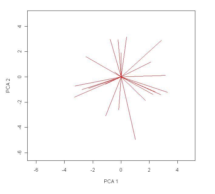
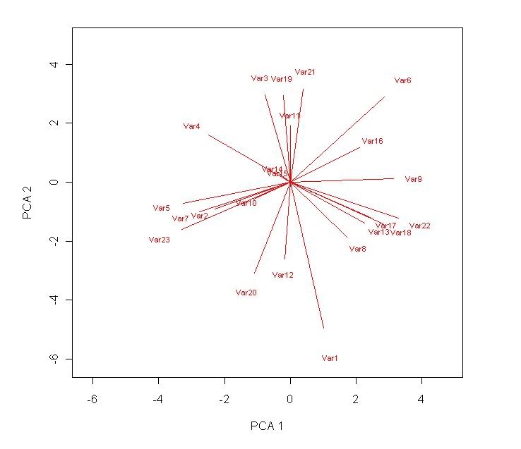
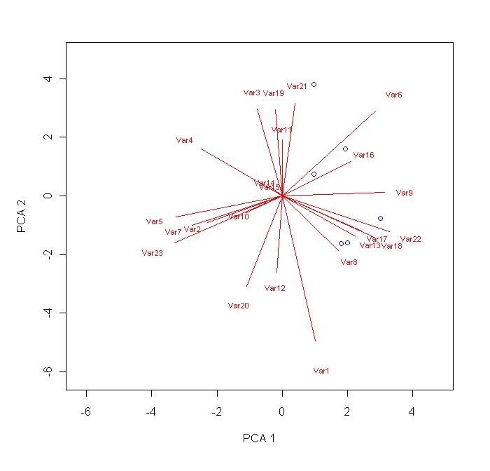
plot(scores[,1],scores[,2],ylab="PCA 2", xlab="PCA 1",type="n",xlim=c(min(scores[,1:2]),max(scores[,1:2])),ylim=c(min(scores[,1:2]),max(scores[,1:2])))
arrows(0,0,loadings[,1]*10,loadings[,2]*10,length=0.1,angle=20,col="red")
text(loadings[,1]*10*1.2,loadings[,2]*10*1.2,rownames(loadings),col="red",cex=0.7)
summary(infile.pca)
}
# - END OF PCA SCRIPT 1 -
# - START OF PCA SCRIPT 2 - [alpha tested ok on 27Jul2010.]
# Data input:
genericRmodePCA2<-function(VarOfInt)# no categorical variables allowed in VarsOfInt
{
R <- cor(VarOfInt)
eig.vec <- eigen(R)
loadings2 <- eig.vec$vectors
#stddev <- sqrt(eig.vec$values)
rownames(loadings2) <- colnames(VarOfInt)
stdize <- function(x) {(x-mean(x))/sd(x)}
X <- apply(VarOfInt,MARGIN=2,FUN=stdize)
scores <- X%*%loadings2
plot(scores[,1],scores[,2],ylab="PCA 2", xlab="PCA 1",type="n",xlim=c(min(scores[,1:2]),max(scores[,1:2])),ylim=c(min(scores[,1:2]),max(scores[,1:2])))
arrows(0,0,loadings2[,1]*10,loadings2[,2]*10,length=0.1,angle=20,col="red")
text(loadings2[,1]*10*1.2,loadings2[,2]*10*1.2,rownames(loadings2),col="red",cex=0.7)
ldgs <- summary(loadings2)
scrs <- summary(scores)
display <- list(ldgs,scrs)
display
}
# - END OF PCA SCRIPT 2 -
# - START OF PCA SCRIPT 3 -
!!! Major Script Editing Required !!!# Data input:
generic #
Red indicates stuff you _absolutely have to edit_.
# Preliminary data manipulation for use of PCA script 3 alpha tested ok 29 Jul 2010]
names(infile)
id.code <- paste(
infile$Var1,infile$Var2,...,infile$Var) # create unique identifier for both sets of data.
infile$code <- id.code
row.names(infile) <- infile$code
infile$code <- NULL
# Var <- as.factor(infile$Var) # all categorical variables should be recognized as a factor. To check: class(Var).
fctrs <- data.frame(infile$Monsoon,infile$Location,year,id.code) # put all the factors into one dataframe, along with the unique identifier.
row.names(fctrs) <- fctrs$id.code
# Now, get rid of all the factors(ie: categorical variables) in the data for PCA. Both dataframes already have the same identifiers.
infile$Var1 <- NULL
infile$Var2 <- NULL
infile$Var3 <- NULL # repeat as necessary.
# PCA script 3 assumes the following:
# 1) There are 2 dataframes.
# 2) Categorical data (factors) and non-categorical data are in seperate dataframes.
# 3) Identifers for both dataframes are identical.
# 4) All factors have the same number of cases.
# 5) Libraries needed for the following scripts are ade4 and xtable. Should probably install any associated dependencies at the same time.
# Before using these scripts:
library(ade4)
library(xtable)
# - START OF PCA SCRIPT 3.1 (Normed PCA with factors)- [alpha tested ok on 29 Jul 2010)
pca1 <- dudi.pca(infile, scann=F,nf=
3) # Assuming 3 factors, the eigen values of which exceed 1. Edit as necessary.
inertie <- cumsum(pca1$eig)/sum(pca1$eig)
barplot(pca1$eig)
# for plots, various permutations of nf(s) and factors.
par(mfrow = c(2, 2))
s.corcircle(pca1$co, xax = 1, yax = 2)
s.corcircle(pca1$co, xax = 1, yax = 3)
s.corcircle(pca1$co, xax = 2, yax = 3)
par(mfrow = c(3, 2))
s.class(pca1$li, fctrs$infile.fctr1, xax = 1, yax = 2, cellipse = 0)
s.class(pca1$li, fctrs$infile.fctr2, xax = 1, yax = 2, cellipse = 0)
s.class(pca1$li, fctrs$infile.fctr1, xax = 1, yax = 3, cellipse = 0)
s.class(pca1$li, fctrs$infile.fctr2, xax = 1, yax = 3, cellipse = 0)
s.class(pca1$li, fctrs$infile.fctr1, xax = 2, yax = 3, cellipse = 0)
s.class(pca1$li, fctrs$infile.fctr2, xax = 2, yax = 3, cellipse = 0) # repeat as necessary
# - END OF PCA SCRIPT 3.1 -
# - START OF PCA SCRIPT 3.2 -[alpha tested ok on 29 Jul 2010]
# - 1-way ANOVA for studying spatial/temporal effects -
options(show.signif.stars = F)
ressta <- anova(lm(infile[, 1] ~ fctrs$fctr1))
xtable(ressta)
graphnf <- function(x, gpe)
{
stripchart(x ~ gpe)
points(tapply(x, gpe, mean), 1:length(levels(gpe)), col = "red",
pch = 19, cex = 1.5)
abline(v = mean(x), lty = 2)
moyennes <- tapply(x, gpe, mean)
traitnf <- function(n) segments(moyennes[n], n, mean(x), n,
col = "blue", lwd = 2)
sapply(1:length(levels(gpe)), traitnf)
}
graphnf(infile[, 1], fctrs$fctr1)
probasta <- rep(0, 23)
for (i in 1:
N) # where N is the number of variables you have in infile.
{
ressta <- anova(lm(infile[, i] ~ fctrs$fctr1))
probasta[i] <- ressta[[1,
x] # where [[1,
x]] is the number of levels in fctr1
}
xtable(rbind(colnames(infile), round(probasta, dig = 4))) # why the hell does the table output in code?!?
intdat <- gl(
x,
y, ordered = TRUE) # gl(x,y,...) - _x_ levels with _y_ cases in each level.
intplan <- cbind(as.numeric(
fctrs$fctr1), intdat)
s.value(intplan, pca1$tab[, 1], sub = colnames(infile)[1],
possub = "topleft", csub = 2)
par(mfrow = c(4, 8))
for (i in 2:
N) # where N is the number of variables in infile.
{
s.value(intplan, pca1$tab[, i], sub = colnames(infile)[i],
possub = "topleft", csub = 2)
}
# - END OF PCA SCRIPT 3.2 -
# - START OF PCA SCRIPT 3.3 - [alpha tested ok on 29 Jul 2010]
# - The Within PCA - [alpha tested ok on 29 Jul 2010]
sepmil <- split(pca1$tab,
fctrs$fctr1)
names(sepmil)
meanspring <- apply(sepmil$spring, 2, mean)
round(pca1$tab[1, ] - meanspring, digits = 4)
wit1 <- within(pca1,
fctrs$fctr1, scan = FALSE)
# names(wit1)
# [1] "tab" "cw" "lw" "eig" "rank" "nf" "c1" "li" "co" "l1"
# [11] "call" "ratio" "ls" "as" "tabw" "fac"
plot(wit1)
# - END OF PCA SCRIPT 3.3 -
# - START OF PCA SCRIPT 3.4 - [alpha tested ok on 29 Jul 2010]
# - The Between PCA -
bet1 <- between(pca1,
fctrs$fctr1, scan = FALSE, nf =
a) # where
a eigen value(s) >1?
# SAMPLE OUTPUT
# names(bet1)
# [1] "tab" "cw" "lw" "eig" "rank" "nf" "l1" "co" "li" "c1"
# [11] "call" "ratio" "ls" "as"
bet1$tab # shows the means of all the variables by group
bet1$ratio # shows the "between group inertia"... whatever the hell that means. :S
bet1$eig # no. of eigen values = number_of_groups -1
plot(bet1)
# - END OF PCA SCRIPT 3.4 -
# In conclusion:
# For y=total inertia of data 'X'
# a = inertia of X-
# b = inertia of X+
# then,
# y=a+b
# wit1$ratio
# [1] 0.6277314
# bet1$ratio
# [1] 0.3722686
# wit1$ratio + bet1$ratio
# [1] 1
# - END OF PCA SCRIPT 3 -
# - BETA TESTED SCRIPT -
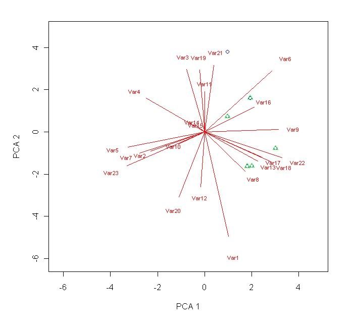
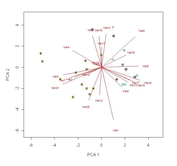
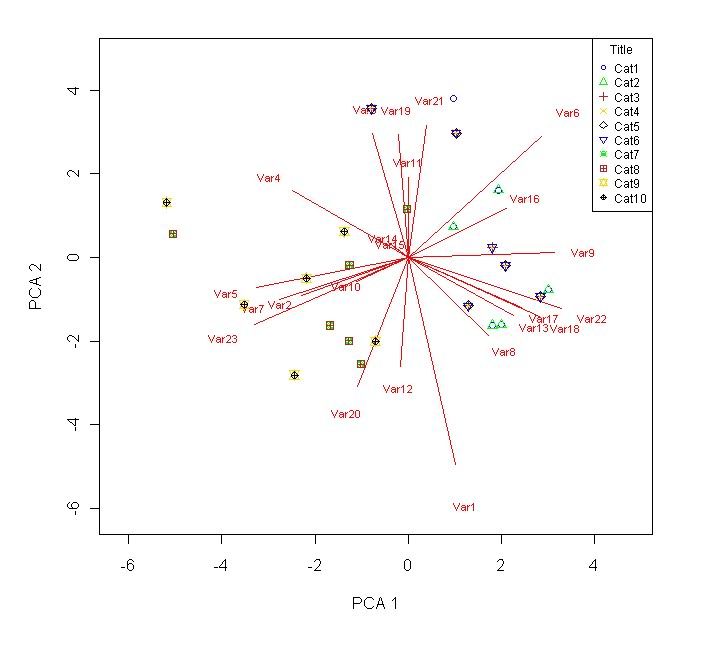
Rpca1 <- prcomp(infile,retx=TRUE,center=TRUE,scale.=TRUE) #
!!! do NOT scale if you have variables that have the same value for all cases !!!loadings <- Rpca1$rotation
scores <- Rpca1$x
rownames(loadings) <- colnames(infile)
bmp("H:/output/Plot.bmp") # outputs the following graph to a bitmap. Comment out if unnecessary.
plot(scores[,1],scores[,2],ylab="PCA 2", xlab="PCA 1",type="n",xlim=c((min(scores[,1:2])-1),(max(scores[,1:2])+1)),ylim=c((min(scores[,1:2])-1),(max(scores[,1:2]+1)))) # defines the main parameters of the plot. With this line, no points, lines, eigen vectors, whatsoever will be produced - just the axis(es))
segments(0,0,loadings[,1]*10,loadings[,2]*10, col="red") # this will produce the line plots of the loadings.
text(loadings[,1]*10*1.2,loadings[,2]*10*1.2,rownames(loadings),col="red",cex=0.7) # label the radial lines produced.
points(scores[
R1:
R2,
C1],scores[
R1:
R2,
C2],pch=
1,col="
blue") # this adds point plots of the specified co-ordinates. R1 is a number specifiying the first row where your data starts. R2 specifies the last row of data. C1 and C2 are both columns (usually corresponding to score column 1 and score column 2).
points(scores[
R1:
R2,
C1],scores[
R1:
R2,
C2],pch=
2,col="
green") # repeat these lines as necessary. You can change the stuff highlighted in blue if you want.
# .
# .
# .
points(scores[
R1:
R2,
C1],scores[
R1:
R2,
C2],pch=
10,col="
black")
leg.txt <- c("Cat1","Cat2","Cat3","Cat4","Cat5","Cat6","Cat7","Cat8","Cat9","Cat10") # Comment out if unnecessary.
legend("topright",legend=leg.txt,col=c("blue","green","firebrick","gold","black"),pch=c(1,2,3,4,5,25,13,12,11,10),cex=0.75,title="Title") # This makes a box with the text in leg.txt appear in the top right. Comment out if unnecessary.
write.table(
loadings,"H:/output/Output-ldgs.txt",sep="\t") # To output the resulting loadings. Comment out if unnecessary.
scrs <- as.data.frame(scores) # Scores are originally in a matrix. Chage to dataframe if you want to save them. Comment out if unnecessary.
write.table(
scrs,"H:/output/Output-scrs.txt",sep="\t") # To output the resulting scores. Comment out if unnecessary.
# - END OF BETA TESTED SCRIPT -
# /* END OF PRINCIPAL COMPONENT ANALYSIS */